
Introducing Historical Metrics: Look Back Up to 31 Days in Your Dashboard

You know the feeling. Someone pings you: "the app felt slow around 2 AM last night." You open your dashboard, and the live graph shows you exactly one thing: right now, everything is fine. The moment you needed is gone, because a live chart only ever knows the present. You are left guessing whether it was a CPU spike, a traffic surge, or nothing at all.
We built Historical metrics to end the guessing. It is now live in every Elestio service dashboard, and it lets you scroll back in time to see exactly what your server was doing when it mattered.
What just shipped
Open any service, go to the Metrics tab, and you will find a toggle between Live and Historical. Live mode still does what it always did, streaming real-time performance as it happens, including live memory usage.
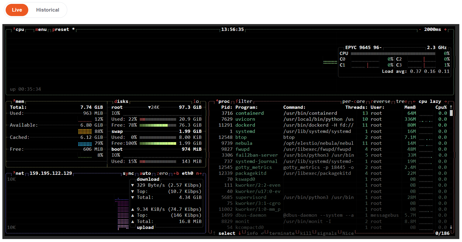
Flip the toggle to Historical and you can look back across four time ranges:
- 6 hours
- 24 hours
- 7 days
- 31 days
Historical mode is the new part: a recorded view of the past, so "what happened last night" becomes a question you can actually answer.
The metrics you can look back on
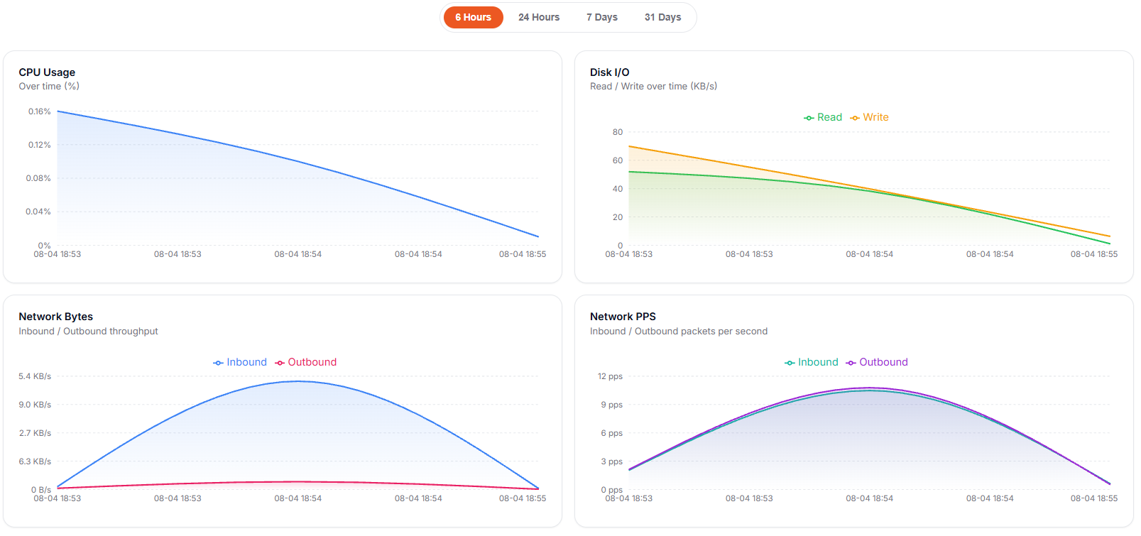
Historical mode tracks four measurements over your selected window:
| Metric | What it tells you |
|---|---|
| CPU Usage | Processor utilization over time |
| Disk I/O | Read and write throughput in KB/s |
| Network Bytes | Inbound and outbound data transfer |
| Network Packets | Inbound and outbound packets per second |
Put together, those four give you a real picture of a moment in the past, not just a number but the shape of what led up to it. Memory usage stays in the Live view, so you still get real-time RAM at a glance.
Why this actually helps
Incident forensics. This is the obvious one. When something went sideways at 2 AM, switch to the 24-hour view and look for the spike. Was the CPU pinned? Did disk I/O jump? Did network traffic surge right before the slowdown? The answer is usually sitting right there in the graph.
Capacity planning. The 31-day view is where the slow-burning problems show up. A CPU baseline that keeps climbing week over week is your app telling you it is outgrowing its VM, and disk I/O that trends steadily upward is often the same story. You cannot see either of those in a live chart.
Right-sizing your server. Before you upgrade (or downgrade) a VM, look at the real numbers over a week or a month. If your CPU never crosses 30 percent, you might be paying for headroom you do not use. If it is regularly redlining, it is time to scale up before your users feel it.
Spotting patterns. Traffic that spikes every day at the same hour, a backup job that hammers disk I/O every night, a report that doubles network transfer on a schedule: these repeat, and the historical view makes them obvious.
A couple of honest notes
Metric availability depends on your infrastructure provider, so it is worth knowing the edges:
- Scaleway and BYOVM (bring your own VM): live metrics only, with no historical data at this time.
- Vultr: only bandwidth data is available through its API, so CPU and disk metrics are not. That bandwidth data also updates periodically and is grouped by full UTC calendar day, so recent intervals may take some time to appear.
On every other supported provider, you get the full set of historical metrics described above. We would rather tell you this up front than have you go looking for a graph that is not there.
Go look at last night
The best part is that there is nothing to set up. If you run a service on Elestio, Historical metrics is already in your dashboard waiting for you. Open the Metrics tab, flip to Historical, and pick a range.
For the full details, including the per-provider specifics, see the Historical metrics documentation. And if you are not on Elestio yet, this is the kind of thing that comes standard with fully managed hosting: the monitoring is just there, no Grafana stack to wire up yourself.
Go pull up last night. We think you will like finally being able to see it.
Thanks for reading ❤️ See you in the next one 👋