
We Shipped a New Elestio Dashboard, Here's What Changed

The Elestio dashboard you logged into this week looks different. Same platform underneath, but the path from "I need a Postgres cluster" to "here's a connection string" got shorter, and a few things we used to bury behind menus now sit on the page where you'd actually expect them.
Here's what changed and what to look for.
A Cleaner Sidebar (and Fewer Round Trips)
The left rail is now split into two groups: the things you build (Services, Clusters, CI/CD, Volumes, Load Balancer, Domains) and the things you manage (Members, Billing, Project Setting, Audit Trail, Account, Support Tickets, Monitoring, Documentation).
Counts now appear inline as small badges next to the relevant items, so you can see at a glance that a project has 14 services, 35 CI/CD pipelines, or 1 volume without clicking through. Audit Trail and Monitoring used to live one level deeper. They're top-level now because that's where most teams open them in the first place.
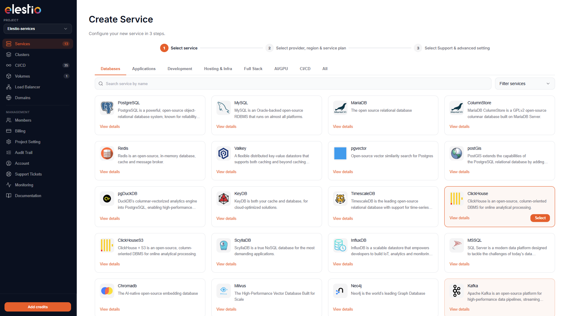
A 4-Step Service Creation Flow
Spinning up a new service is now an explicit four-step wizard:
- Select service: the catalog grid, filterable by category (Databases, Applications, Development, Hosting & Infra, Full Stack, AI/GPU, CI/CD, Git).
- Select provider, region & service plan: pick your cloud (AWS, Hetzner, Netcup, Linode, DigitalOcean, Scaleway, Vultr, OVH, Lightsail) and VM size.
- Provide service name & cluster config: auto-generated names you can override, plus a clear toggle between Single Node and Primary/Replica.
- Select support & advanced settings: three support tiers (Basic / Pro / Business) priced by the hour, plus optional advanced config.
The progress bar at the top of every step tells you where you are. The right sidebar always shows the running summary: software, version, plan, provider, region, specs, IPv4, and an Estimated Monthly Cost that updates as you change selections. No more clicking "Create" only to find out it costs more than you thought.
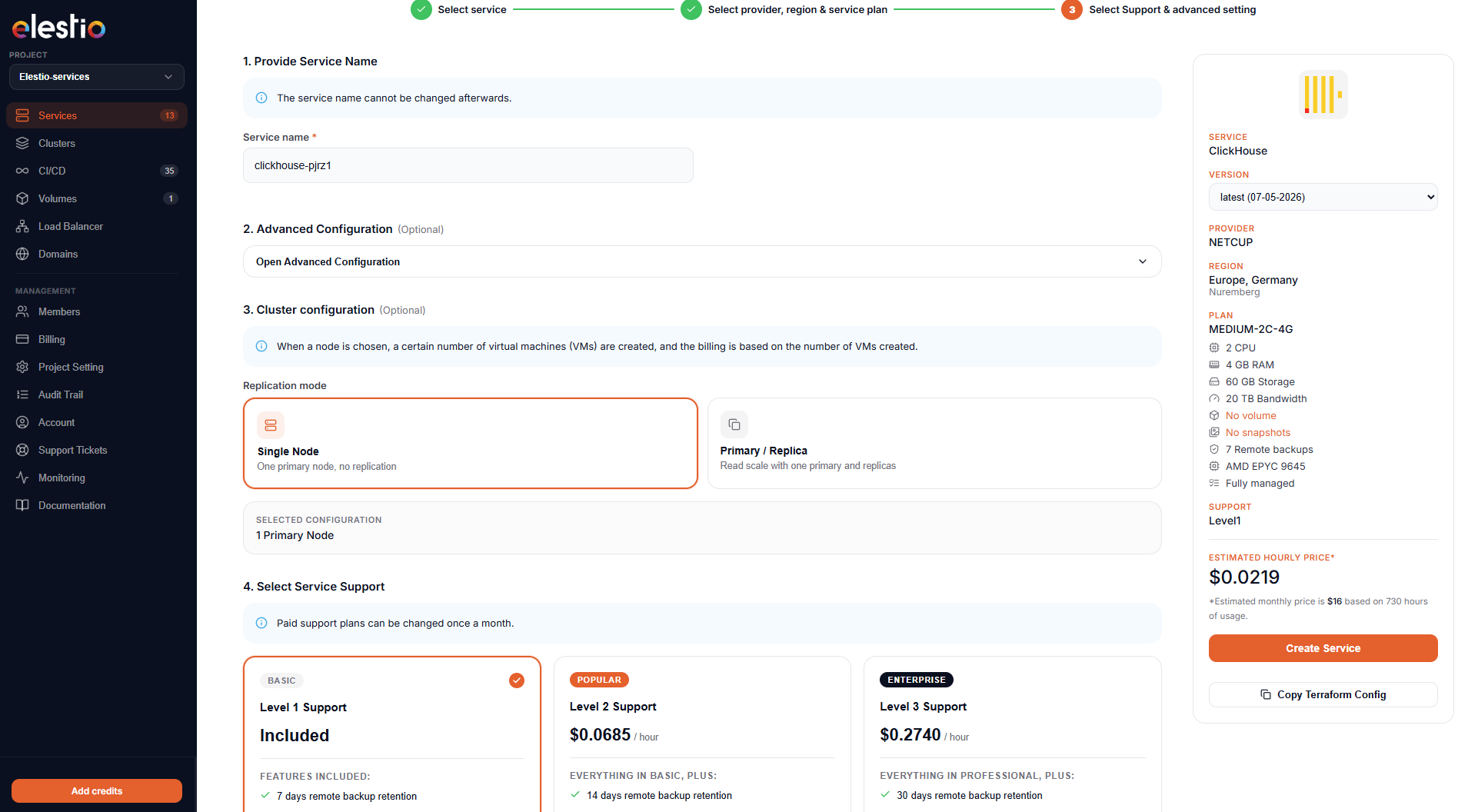
A small but welcome detail: every config page has a Copy Terraform Config button next to the Create CTA, so the same setup you just clicked your way through can be checked into a repo as code.
Service Detail Page: Credentials Where You Expect Them
Open any running service and the Overview tab now leads with two things you actually need: Termination protection (a single toggle) and Connect to your service (your credentials, inline).
The credentials card shows HOST, PORT, USER, PASSWORD, and the ready-to-paste CLI command, each with its own copy button. There's a Hide credentials toggle for screen-sharing. The Admin software (pgAdmin, phpMyAdmin, the ClickHouse UI, whatever ships with your service) opens with one click below.
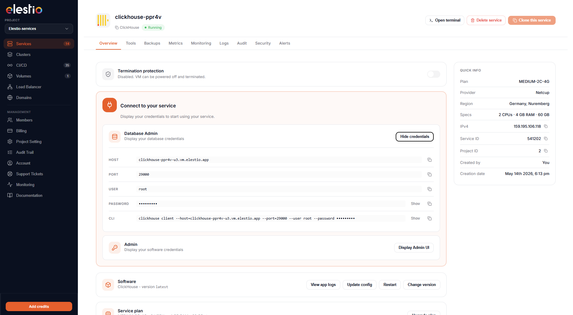
The right rail keeps the Quick Info card pinned: plan, provider, region, full specs, IPv4, service ID, project ID, who created it, and creation date. The fields that matter for support tickets are now copy-able directly from this card.
Your Existing Tools, Now in One Tab
VS Code, the File Explorer, the in-browser Terminal, SSH/SFTP details, and the Reset Password flow were already there. They were just scattered across different pages and modals depending on the service. The new Tools tab puts all five in the same place on every service:
- VS Code: browser-based editor running on your VM, one click.
- File Explorer: upload, download, navigate without dropping into a terminal.
- Terminal: direct console access in your browser.
- SSH/SFTP: connection details on demand, no key-hunting through your password manager.
- Reset Password: for SSH/SFTP, separated from the database credentials so you don't fat-finger the wrong reset.
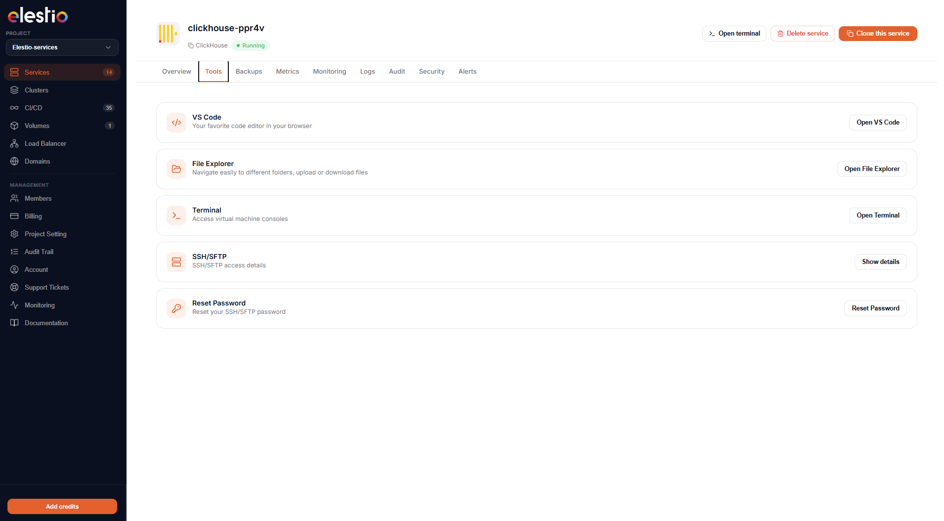
Nothing new under the hood. What's new is that the layout is identical whether you're poking at a Postgres cluster, an n8n install, or a CI runner. Once you know where the Terminal lives, you know where it lives on every service in your fleet.
The Tabs Are Standard Across Every Service
Every service detail page now shares the same tab strip: Overview, Tools, Backups, Metrics, Monitoring, Logs, Audit, Security, Alerts. That consistency matters more than it sounds. If you're managing a fleet (one ClickHouse, two Postgres replicas, an n8n, a Mautic, a few CI runners), you don't have to relearn the layout for each one. Audit lives in the same place on every service. So does Alerts.
Live Cost Preview, Side by Side With the Config
Two visible changes here:
- The plan summary on the right side of the create flow now shows the hourly rate and the monthly estimate side by side. If you're sensitive to burst hourly billing (CI agents, ephemeral environments), the hourly number is what you want.
- Support tiers (Basic free, Pro at $0.0685/hour, Business at $0.2740/hour) are now their own selection step with clear inclusions. No buried checkbox.
This is the kind of thing that looks small in a screenshot but saves a support ticket a month from now.
What This Doesn't Change
The underlying platform is the same: same providers, same one-click catalog, same automated backups, same managed updates. The redesign is about reducing the number of clicks between intent and outcome, not changing what's underneath.
If you're already running services, log in and look around. The new sidebar grouping and the Tools tab are where most users will notice the difference first. If you're evaluating Elestio, the new create flow is the cleanest demo of what the platform does: pick a service from 400+, pick a region, get a running cluster with credentials, monitoring, backups, and a terminal in your browser.
Try it: elest.io. Feedback welcome.
Thanks for reading ❤️ See you in the next one 👋